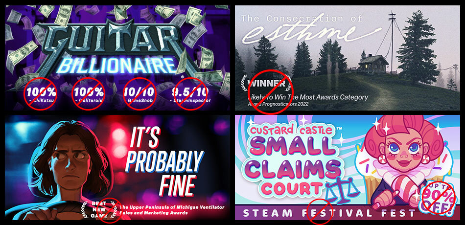
Recently, Valve noticed more text, award logos, and even review scores being included by game developers in their graphical asset images. This made them realize the guidelines haven't been as clear as they should be. As a result of not having clearly-defined rules, Valve have seen additions to graphical assets that are creating a confusing and sometimes even inaccurate experience for customers.
For example, some game logos themselves have become so small that it's hard for players to tell what the name of the game is. In other cases, graphical asset images are so cluttered with award logos and ratings that it is distracting and hard to read.
The changes will go into effect on September 1st.
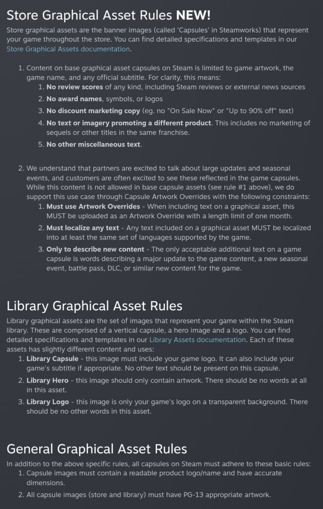
Here's what's new:
Source: Valve

