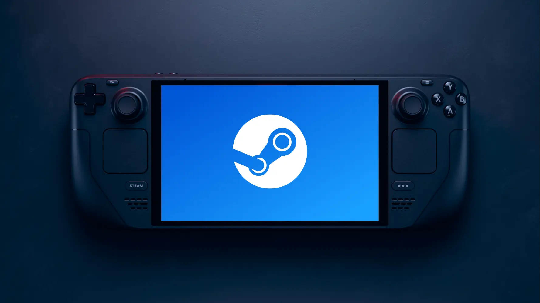
Valve just released a Steam Deck Client Beta update that focuses on restructuring the virtual menu for Steam Input, as well as improving performance of the Media tab when having a lot of screenshots. This includes being able to tab to the next screenshot when looking at one in full screen:
General:
- Improved Media page performance for users with a large number of screenshots
- Restyled the Media page to show more screenshots at one time
- Fullscreen screenshots can now be scrolled through by pressing left/right
- Fixed an issue loading game carousel items on the home recommended tab
- Fixed an issue where the on-screen keyboard would not type into chat tabs
Overhauled the Virtual Menu feature in Steam Input:
- The visual style of virtual menus has been updated
- Virtual Menus can now be named and moved between difference sources or converted between menu types
- Bindings such as keyboard keys or gamepad buttons will now display glyphs when the user has not manually picked an icon
- Icons and colors can now be assigned in the configurator
- Menu items can now be easily reordered
- Responsiveness of the cursor and general performance has been improved
You can find the changelog and discussion over on Steam.
The Media tab changes are really nice, but this virtual menu overhaul is awesome! With a full new visual style, icons and glyph integration, and full labeling support, there’s a lot to love here!

Noah Kupetsky
A lover of gaming since 4, Noah has grown up with a love and passion for the industry. From there, he started to travel a lot and develop a joy for handheld and PC gaming. When the Steam Deck released, it just all clicked.
Steam Profile


